Thursday, December 25, 2008

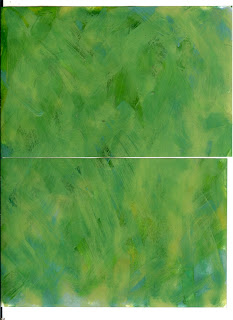
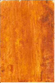
More Inspiration from Altered Papers


I am participating in a Snowflake ATC swap on ATCs for all. And, I received even more inspiration from the altered papers mentioned in the last post. Here are the results!

Sunday, December 21, 2008

Chunky Trees


I was fortunate to be able to trade altered papers with an extremely talented group of artists. Their papers provided much needed inspiration for four tree-themed chunky pages I needed to create for an ATCsforAll swap I'm participating in. I'm sure all of the papers will be making appearances in upcoming projects.

You can view the blogs of some of these talented artists at
http://www.clevelandgirlie.blogspot.com and
www.creativeinspirations.blogspot.com and
www.opheliasart.blogspot.com

Saturday, November 29, 2008

Another page for Fiona's book


I finished another page in Fiona's 'flight' book. The background for this one was done with gold and turquoise Lumieres.

Brayered and Gessoed Altered Paper


Ophelia (http://opheliasart.blogspot.com/) is moderating a quick altered paper swap and is allowing me to participate.

I created some papers using a Creole Spice rainbow pad, some distress inks, and some gesso, along with a few Paper Artsy and Stampers' Anonymous stamps. I can't take credit for this class, I learned the technique in a class created by Julie at our best local stamp store - Cornerstone.

Step 1 - I brayered with the rainbow pad, going randomly in different directions.

Step 2 - Apply a coat of gesso using either an old credit card, or I use an old room key from one of my work related travels (they're good for something after all). Don't worry about making the layer completely even. Missing some spots makes it more interesting.

Step 3 - Stamp some background stamps with coordinating colors. I used distress inks for this, because I evenrually want the images to be barely visible.

Step 4 - Finish by adding another layer of gesso, and some ink direct to paper to give some depth.

Brayered and Gessoed Altered Paper - Step 2

Brayered and Gessoed Altered Paper - Step 3

Brayered and Gessoed Altered Paper - Step 4

Sunday, November 23, 2008

Architecture ATCs


I am participating in an architecture ATC Swap for a group called ATCs for all. For these swaps you can create all your cards the same, or make different ones.

In this case, I chose to do three different designs. The first is colored with Stewart Superior Memories mists and then stamped with Adirondack Pesto. I used a Basic Grey rub on for the white design. For the second, I used Nancy Curry's resist technique on white glossy, stained with Distress and Adirondack Inks. The last one was colored with gesso and dye inks, and stamped with Versafine.

Saturday, November 22, 2008

Flapper Fairies


Another page in Fiona's IT book. For this page, I painted the background with some purple and blue Twinkling H2O's and then stamped some swirls for interest. The images are from etsy.

You have wings


I loved this quote, and decided to pair it with one of my favorite images.

In case you can't read it in the scan, here's the quote:
You were born with potential
You were born with goodness and trust
You were born with ideals and dreams
You were born with greatness
You were born with wings
You are not meant for crawling, so don't.
You have wings
Learn to use them,and fly.


I'm not even sure whose stamp this is anymore, but I think it might be Lost Coast. I stamped the image on vellum and applied it to the page which I had colored DTP with Distress Inks. The paper in behind the quote was some pearlized text weight paper I had left from making wedding invitations this summer. I embossed a design from a Judikins bolio, but it was too subtle. I rubbed the paper with some copper Brilliance to get this effect. Happy accident!

Getting a start on Fiona's IT


The next IT girl project I'm working on is for Fiona. Her theme was inspiration, something that inspires you. I've chosen to do a little book on flight and wings. Art is one of the things that gives me wings and lets me fly to places I love to go!

The front of the book is coated with gesso and distress inks. I stamped a few background designs with distress ink, and then applied another thin coat of gesso to make the designs more subtle.

Friday, November 21, 2008

Experimenting with Paintstiks


I recently purchased some Shiva Oil Paintstks. These are oil paint in solid form, and can be used on both fabric and paper. They come (as the name would imply) in stick form. You simply peel off the outer layer and either paint directly with them, or use them with a stencil brush. In this case, I used a Dreamweaver stencil and first dry embossed the image. It's been a while since I've done any of that, and part of the reason is that I felt in the past it was a little restrictive, since you needed paper that was light enough to see through to the stencil. Now that I've discovered the radiant rains, that's a problem easily solved - I sprayed the paper after I'd finished stenciling. Then I turned my paper over, and placed the stencil over the embossed image again. Not being the smartest sometimes, it took me a while to figure I needed to flip the stencil over to make it line up again. But, once I got that done, I scribbled some gold painstik onto my craft sheet (that way you don't waste any paint since it doesn't absorb) and used a stencil brush to apply it to my embossed design. The paint can take up to 24 hours to dry completely, but this seemed ready a lot sooner. I used a little gold embossing power on the edges to get a border.


Monday, November 17, 2008

Chrissy's Nature IT


Getting caught up with the Art Venture IT girls, little bit by little bit.


I have finally finished Chrissy's item, with a technique I was fortunate to learn in a Tim Holtz class a few weeks ago. A store near here won a contest, the prize for which was a weekend with Tim Holtz. I know some of you have attended classes with him before, and what a treat it is. This class was for a shrink plastic mosaic technique using the melt pot to coat clear shrink in UTEE and shrink it at the same time. The resulting tiles are then colorized with alcohol inks and images glued to the back. You always know it's a good class when you can't wait to try the technique again, and here's the result. Hope Chrissy enjoys it.


Sunday, November 9, 2008


Finally back to creating (and scanning).
I've been in a bit of a creative funk lately, and the things I have done, I haven't even remembered to scan. With the leaves almost all off the trees, time for me to turn over a new one. I finally finished Adrienne's IT Medieval gift.

I started with a plain cardboard slide mailer and after several finishes I didn't like, finally settled on coating the outside with several layers of embossing powder to get a faux metal finish. I added a collage image and some bling to finish it off. I painted the inside with gold and silver Lumiere paints, and applied a little magenta in the slide holders for a pop of color. I overstamped a design in copper and added some collage elements to finish. I was a little worried about using glass slides, since this is mailing internationally, so I used some transparencies to create the effect instead. Hope Adrienne enjoys it! And I hope it truly is better late than never.


Monday, April 28, 2008

Double Deuce Dare You!


Thanks to Pea on CC Swaps, I got to participate in one of the most fun and challenging swaps you could imagine. In my mailbox, I received an AOL tin, stuffed with all sorts of amazing bits and pieces. Our mission - make something with it!

I fretted for a very long time, but finally my inspiration came from the scrabble tiles the came in my package. They spelled 'UNIQUE'. There were also lots of images - the ones I chose were of a boy, a man, and a woman. Hmmmm, boy goes to school, journeys around the world to seek his fortune, is smitten by a lovely lady, marries, and lives a rich and colorful life in between. That's what my package (and my muse) said to me.

Here is what I made, along with an explanation of what I used and what I added.

First, the tin....
I sponged the tin with Lumiere paints and painted the scrabble tiles I received with Twinkling H2O's to give them some sparkle. The bottle cap and the metal charms were also part of my package - I colored those with gold Krylon pen and added some images and words to begin telling my story. I lined the inside of the tin with some papers I had on hand, and started to work on a tag book I wanted to place inside. I decided I'd like it to fit diagonally, so I trimmed the bottom corners to get it to fit snugly. Both the image and the twill tape on the front were included in my Double Dare.

Double Deuce - Our Hero Seeks His Fortune


On the next page, our hero begins to seek his fortune. In my package were conveniently placed a fortune telling card, with a swami, a slide mount, and some travel images. The swami fit perfectly in the slide mount, which I finished with some distress inks and a text stamp. Everything on this page, with the exception of the postmark came in my package in some form or another.

Double Deuce Dare - Love is in the Air


The next page started out with a silver german scrap shrine and a mysterious woman. These were both in my package as well. I used alcohol inks to color the shrine, and the hearts are part of another image from the previous page.

Double Deuce - Fulfullment


Our hero experiences love at first sight, and marries his dream girl on the next page. These are images that I had on hand, and they seemed to fit. At the end, he's looking back on a fullfilling life, time has flown by too quickly! The watch face was included in my package, and the little beauty that is my thoughtful older man came from Adrienne in a previous swap. Fits perfectly - thanks Adrienne!!


What a fun project this was - thank you Pea!


Sunday, March 16, 2008

Background ATC's


This month's ATC theme on CC Swaps was backgrounds. We have recently switched so that we do two sets of 5 rather than a single set of 5. For the first card, I chose to do embossing powder enamel. The entire card is covered with embossing powder and then additional colors are added on by sponging on the embossing powder. Then I stamped the diamonds and embossed them in black so that they melt into the enamel. I learned this technique at a demo of Powder Keg embossing powders.

The second card as done by applying bands of color direct to paper and then using lots of impress me stamps to get color. A few of them were stamped with Lumiere gold paint. Then I created strips of gold paint between the bands with a credit card. Thanks to Julie Jarvis of Cornerstone Art Stamps for this one.

Saturday, March 15, 2008

Another deco book


These little books are so exciting to receive and work on. And what a great added bonus, you get to see the wonderful artwork of those who have gone before.


I've just received my second deco, and added my pages. For this one, I used a brilliance rainbow pad DTP and stamped some texture for the background. The flower is another Basic Grey Rub On. Hope the eventual recipient likes it!


Friday, March 7, 2008

First Deco Book arrives


I'm currently participating in a round robin deco book swap. Each person's book makes a journey to several other swappers until it's been filled with art by everyone. There's no theme, so you can do whatever strikes you.


I decided to use a background technique I just learned at a class last night. It involves gesso, direct to paper and stamping. I didn't get too adventurous with the colors yet, I didn't want to take a chance. (-;


Sunday, March 2, 2008

Leafy Little Beauties


I just finished my second swap of these. Having a theme to stick to was a bit more challenging, and really fun. I happen to know my partner for this one likes birds, so I made sure to include a few. I did stretch the leaf theme a little on the few of these, but every one has at least something leafy, even if it's ginko leaves in the background.


Backgrounds - Acrylic Resist


I can't take credit for this technique, I learned it at Cornerstone, my favorite stamp store.


To create this effect, I painted broad strokes of one or two colors of cheap acrylic paints onto various papers. How much white space you leave changes the end result. After the paint was dry, I sponged on some dye reinkers to fill in the rest of the space, wiping the excess off with a paper towel. The paint resists the reinker, and gives a brush stroked background.


Here are some samples...

Sunday, February 17, 2008

Brid Tip-In Page


This month's Tip-in (8 1/2 x 5 1/2 inch page was birds. For the front of my page I painted a background using cheap acrylic paints and dye reinkers. The first one was way too dark, so I put gloss medium on it, and used it as a background. I had to borrow the bird stamps (thank you Mary!) because I don't have any, and then I found a sheet of Basic Grey rub-ons in our local craft store. Who knew rubons could be so much fun! The images, front and back are from etsy. The back was inspired by the background paper that I just needed an excuse to use.


Friday, February 8, 2008

More credit cards and acrylics


Once I got started, it was really hard to quit! Here are some more examples. One with a lot of different colors scraped over yellow. One with reds and oranges, and then very thick yellow scraped on top wiggling the credit card in waves, another with reds, oranges and browns, and a mini-folder that I hope to use for my little beauties. This one was scraped first and then sponged with gold lumiere paint.


Credit Cards and Acrylic Paints


I was introduced to this technique by the Next Generation Stampers' Group and finally got a chance to play around with it a little today.


I've posted some of my results here.


Blues, greens, and yellows were my first attempts. The first one I did was mixed with lots of matte medium, so the colors are more transparent. Then I used the paint closer to full strength and finally, since there was a good but of paint on my nonstick sheet - I just put the third sheet onto the craft sheet, and then added some texture with a paper towel.


Monday, February 4, 2008

Little Beauties


I am participating in a swap on CC Swaps that requires 10 little beauties. I chose the smallest size for mine - 1 1/2 by 2 1/2 inches for mine.


I absolutely loved doing these, I made myself a rule that every background had to be something from my scrap basket. Those who I have swapped with in the past may even recognize some of them. One of the things I like best is that since I'm not making multiples is that if I have 1 image, 1 embellishment, 1 tiny bit of scrap I can use it.


Pointy Party Hats


I recently participated in a swap where the theme was pointy party hats. Knowing of course, that everyone looks better with a party hat, I chose an image from a Ten Two Studios CD. The word stamp is from Stamp Camp. I used one of the backgrounds that I had made for the Background Noise challenge for these. (Oops, those were really supposed to go in the journal, but I got carried away!)


Sunday, January 20, 2008

Paris Tip-in


Here is my tip-in page for the CCSwaps group -themed around Paris. For the front, I chose that Paris icon, the Eiffel tower. This one is from a digital collage sheet from etsy, and I printed in on transparency to give it a little bit of a different look. I added some bits and pieces from stickers and other ephemera collage sheets. I stamped some fleur-de-lis on the background, but they're pretty subtle. There's also a separate torn piece of paper on the left, but it almost blends in too well. For the back I chose an image of Audrey Hepburn. Even though she's not French, she always gives me that vibe. The background is a piece of Stampington paper.


Tuesday, January 1, 2008

Complementary Colors


I'm heading out of town today for a business trip, so I needed to complete a swap before I left. This one was entitled complementary colors and required that we make something using just complementary colors (with just a touch of black and/or white if needed. I chose to use blue and orange as my combination. Also, one of my New Year's Art Resolutions was to use stamps that I haven't used before. I love these Impress Me images, but for some reason, they never make it into my art, but they did this time! These are stamped onto glossy paper that I first stained blue with Broken China distress ink. The orange paper has a bit of a metallic sheen, and the small embellishments are shrink plastic stamped with pieces of the same design.

Shining Stones


Creative cards is running a swap for a technique called shining stones. I haven't signed up for the swap yet, but I did have a play with the technique which uses dye ink, brayered over glossy card stock, then spritzed with water, and brushed with a paste made from perfect pearls. At that point you spritz it again and then use a paper towel, with a twisting motion to pull off some of the water and create texture. Because I have a lot of it, I used Pearl-Ex and mixed it with a little gum arabic and some water so it would be sealed. For the blue/green card I used gold and duo blue/green Pearl-Ex, and for the rainbow card, I just used gold.
A special thanks to Trish Bee and all the Art Venture members. Thanks so much for encouraging, prodding, and pushing those of us who have a little trouble leaving the comfort of our usual zones into new and ever more exciting artistic endeavors.